Google is replacing the side-scrolling card carousel inside Google Wallet on Android with a vertical stack, pushing the layout to a much broader set of devices this week.
The tweak began testing with a handful of users in September, but reports from 9to5Google and Android Authority confirm it is now surfacing widely on Pixel handsets through a server-side switch. You do not need an app update from the Play Store to see it.
For years, Google Wallet lined up credit and debit cards side by side. Finding a specific card meant swiping back and forth across a horizontal row, with only a sliver of the adjacent cards visible on either edge. It worked fine if you carried two cards. It was clunky if you managed five.
The fresh interface rethinks that screen space. On the main page, Wallet now displays one full card preview alongside the edge of a second card resting near the top. Tapping the card or dragging down opens a dedicated fullscreen interface. Inside, your payment cards appear stacked vertically, mimicking a physical billfold. Most of each card remains visible at once, so you can pick the exact payment method you need without repeated sideways swipes.
That arrangement keeps everyday clutter under control. Your transit passes, tickets and loyalty cards stay anchored on the primary homepage, while banking cards live inside their own expandable layer.
It also alters basic navigation in subtle ways. Tap-to-pay still works by picking a card, but inspecting card details or browsing past transactions now requires tapping a gear icon tucked into the upper right corner. That adds an extra tap for anyone checking receipts after a purchase. At the bottom of the stacked tray, a dedicated button labeled "Manage payment methods" lets you set a default card or reorder your deck, making it simple to keep your preferred accounts down where your thumb naturally rests.
Because Google controls the rollout on the server side, the new layout will simply appear on your phone once the company flips the switch on your account. The wider release is actively hitting devices now.
SDFiled by The Software Desk
Apps, platforms, operating system releases, security fixes and the features arriving in them.
More from this desk →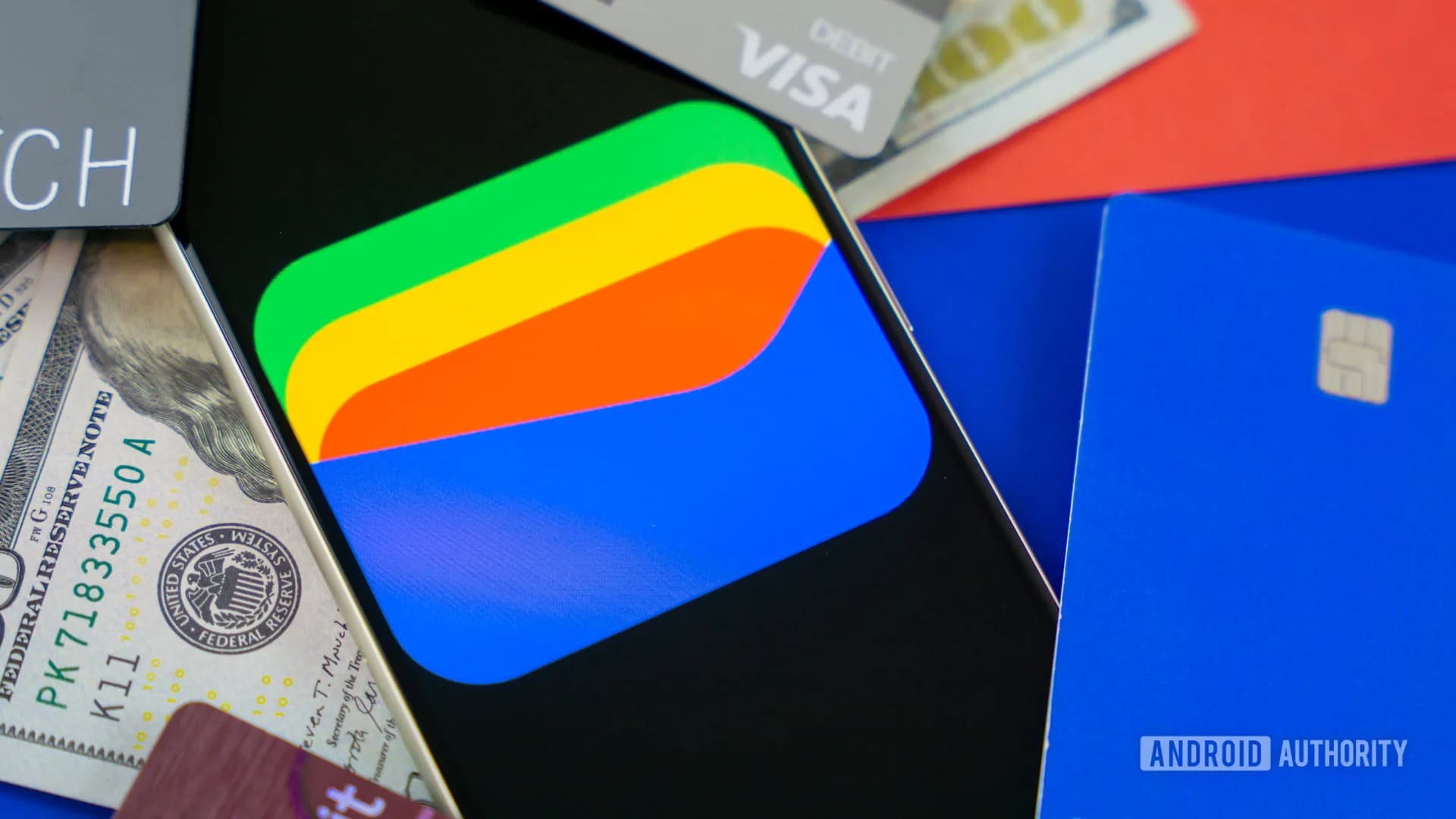
Be the first to comment
Join the argument. No password, just your email or a passkey.